


Painting for beginners: color wheel
At primary school we learn that you can mix all colors from yellow, red and blue. Yellow and blue makes green, yellow and red makes orange, red and blue makes purple. You get brown by mixing everything together. Add black and white to your palette and you can start painting, is the idea. Many beginning adult painters have forgotten the lessons of primary school, so in lesson 3 of the beginners course we will make a color circle.
primary colors
As in all specialised fields, art also has its own jargon. You could entirely ignore it and explain time and again in a cumbersome way and point to what you mean, but it is easier for communication to learn a few terms by heart.
-Primary colors are red, yellow and blue.
– Secondary colors are purple, green and orange.
-Tertiary colors are colors that consist of a mixture of the three primary colors (brown, for example).
mixing colors
When mixing the colors, the exercise is to mix step by step from yellow to red (for example). In your head you may see a gentle sunset-like transition from one color to another, but it can be difficult to actually achieve this with paint. When mixing with your palette knife, you notice that one color is “stronger” than the other, which means that you need much less of it. Because blue is stronger than yellow, for a beautiful green you take a bit of blue with a lot of yellow. Mixing itself requires a technique where you use the palette knife on the palette, like buttering a little piece of toast, so without smearing paint all over the entire palette.
all colors?
With a random set of red, blue and yellow you can unfortunately not mix all colors. Too bad, primary school children! In the printing world we work with 4 colors: cyan, magenta, yellow and black. With that they can print (almost) all colors. However, these are very specific types of blue, yellow and red. For example, Magenta looks more like a bright pink than the archetypal fire-red. When you go to the store to buy oil paint and you want to start with a limited number of tubes, buy six primary colors instead of 3. Plus a very dark brown and white. Your shopping list:
-lemon yellow
-warm yellow
– (dark) pink red
-tomato red
-ultramarin blue
-prussian blue
-raw umber (dark brown)
-titanium white
You’ll see that if you try to mix purple using a tomato red and a prussian blue, the result looks more like an aubergine. While ultramarine blue and a pinkish red mix to a beautifull purple. In this painting class for beginners, a lot has to be tried out, because no color is “wrong”. When you paint a still life with aubergines you do not need a perfect purple, but that brownish color, and now you know what colors you need.
complementary colours
Complementary color pairs are sets of 2 colors that face each other on the color circle:
-yellow and purple
-red and green
-blue and orange
If you place these colors side by side, the eye does not know what is close and far away. It has a strangely sizzling effect. If you want to direct the attention in your painting to one specific area, then you can use the effect of a complementary color pair. If you exaggerate it, you get a headache inducing painting that does not have any depth in it.
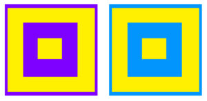
the effect of complementary colors
freedom in use of color
You are free to paint a landscape with only red and blue, or a still life with red bananas. Monet’s eyesight got worse and worse at the end of his life, and therefore he used more red, the only color he still perceived well. Vincent van Gogh painted his shadows blue and wheat fields bright yellow; he exaggerated the color he experienced when he looked at the world. André Derain completely let go of realistic colors and painted 30 paintings of London in super-bright ultramarine, magenta, red and emerald green. Color is a way to create atmosphere and expression: discover which colors and color combinations you like by experimenting.
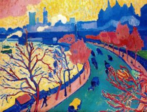
“Charing Cross bridge” André Derain 1906
Would you like to learn how to paint? Click here to see whether you can start a course soon.

OF INTEREST
Johannes Itten wrote a widely read book about the workings of colors: “The Art of Colour”. In the introduction of the simplified version ” The Elements of Colour” Faber Birren writes: “to help a student discover his subjective forms and colors is to help him discover himself”.
Here you can read fragments of Elements of Colour on google books
Can color in daily life, on walls, curtains and computer screens, change your mood? Read here an interesting article on bbc future


share this post